

Julie Steele is an editor at O'Reilly Media interested in connecting people and ideas. She finds beauty in discovering new ways to understand complex systems, and so enjoys topics related to organizing, storing, and visualizing data.
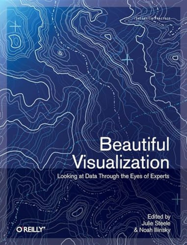
Meer over de auteursBeautiful Visualization
Looking at Data Through the Eyes of Experts
Samenvatting
Visualization is the graphic presentation of data - portrayals meant to reveal complex information at a glance. Think of the familiar map of the New York City subway system, or a diagram of the human brain. Successful visualizations are beautiful not only for their aesthetic design, but also for elegant layers of detail that efficiently generate insight and new understanding.
This book examines the methods of two dozen visualization experts who approach their projects from a variety of perspectives - as artists, designers, commentators, scientists, analysts, statisticians, and more. Together they demonstrate how visualization can help us make sense of the world.
- Explore the importance of storytelling with a simple visualization exercise
- Learn how color conveys information that our brains recognize before we're fully aware of it
- Discover how the books we buy and the people we associate with reveal clues to our deeper selves
- Recognize a method to the madness of air travel with a visualization of civilian air traffic
- Find out how researchers investigate unknown phenomena, from initial sketches to published papers
Contributors include:
Nick Bilton, Michael E. Driscoll, Jonathan Feinberg, Danyel Fisher, Jessica Hagy, Gregor Hochmuth, Todd Holloway, Noah Iliinsky, Eddie Jabbour, Valdean Klump, Aaron Koblin, Robert Kosara, Valdis Krebs, JoAnn Kuchera-Morin et al., Andrew Odewahn, Adam Perer, Anders Persson, Maximilian Schich, Matthias Shapiro, Julie Steele, Moritz Stefaner, Jer Thorp, Fernanda Viegas, Martin Wattenberg, and Michael Young.
Specificaties
Over Noah Iliinsky
Inhoudsopgave
1. On Beauty
-What Is Beauty?
-Learning from the Classics
-How Do We Achieve Beauty?
-Putting It Into Practice
-Conclusion
2. Once Upon a Stacked Time Series
-Question + Visual Data + Context = Story
-Steps for Creating an Effective Visualization
-Hands-on Visualization Creation
-Conclusion
3. Wordle
-Wordle's Origins
-How Wordle Works
-Is Wordle Good Information Visualization?
-How Wordle Is Actually Used
-Conclusion
-Acknowledgments
-References
4. Color: The Cinderella of Data Visualization
-Why Use Color in Data Graphics?
-Luminosity As a Means of Recovering Local Density
-Looking Forward: What About Animation?
-Methods
-Conclusion
-References and Further Reading
5. Mapping Information: Redesigning the New York City Subway Map
-The Need for a Better Tool
-London Calling
-New York Blues
-Better Tools Allow for Better Tools
-Size Is Only One Factor
-Looking Back to Look Forward
-New York's Unique Complexity
-Geography Is About Relationships
-Sweat the Small Stuff
-Conclusion
6. Flight Patterns: A Deep Dive
-Techniques and Data
-Color
-Motion
-Anomalies and Errors
-Conclusion
-Acknowledgments
7. Your Choices Reveal Who You Are: Mining and Visualizing Social -Patterns
-Early Social Graphs
-Social Graphs of Amazon Book Purchasing Data
-Conclusion
-References
8. Visualizing the U.S. Senate Social Graph (1991–2009)
-Building the Visualization
-The Story That Emerged
-What Makes It Beautiful?
-And What Makes It Ugly?
-Conclusion
-References
9. The Big Picture: Search and Discovery
-The Visualization Technique
-YELLOWPAGES.COM
-The Netflix Prize
-Creating Your Own
-Conclusion
-References
10. Finding Beautiful Insights in the Chaos of Social Network Visualizations
-Visualizing Social Networks
-Who Wants to Visualize Social Networks?
-The Design of SocialAction
-Case Studies: From Chaos to Beauty
-References
11. Beautiful History: Visualizing Wikipedia
-Depicting Group Editing
-History Flow in Action
-Chromogram: Visualizing One Person at a Time
-Conclusion
12. Turning a Table into a Tree: Growing Parallel Sets into a Purposeful Project
-Categorical Data
-Parallel Sets
-Visual Redesign
-A New Data Model
-The Database Model
-Growing the Tree
-Parallel Sets in the Real World
-Conclusion
-References
13. The Design of "X by Y"
-Briefing and Conceptual Directions
-Understanding the Data Situation
-Exploring the Data
-First Visual Drafts
-The Final Product
-Conclusion
-Acknowledgments
-References
14. Revealing Matrices
-The More, the Better?
-Databases As Networks
-Data Model Definition Plus Emergence
-Network Dimensionality
-The Matrix Macroscope
-Reducing for Complexity
-Further Matrix Operations
-The Refined Matrix
-Scaling Up
-Further Applications
-Conclusion
-Acknowledgments
-References
15. This Was 1994: Data Exploration with the NYTimes Article Search API
-Getting Data: The Article Search API
-Managing Data: Using Processing
-Three Easy Steps
-Faceted Searching
-Making Connections
-Conclusion
16. A Day in the Life of the New York Times
-Collecting Some Data
-Let's Clean 'Em First
-Python, Map/Reduce, and Hadoop
-The First Pass at the Visualization
-Scene 1, Take 1
-Scene 1, Take 2
-The Second Pass at the Visualization
-Visual Scale and Other Visualization Optimizations
-Getting the Time Lapse Working
-So, What Do We Do with This Thing?
-Conclusion
-Acknowledgments
17. Immersed in Unfolding Complex Systems
-Our Multimodal Arena
-Our Roadmap to Creative Thinking
-Project Discussion
-Conclusion
-References
18. Postmortem Visualization: The Real Gold Standard
Background
-Impact on Forensic Work
-The Virtual Autopsy Procedure
-The Future for Virtual Autopsies
-Conclusion
-References and Suggested Reading
19. Animation for Visualization: Opportunities and Drawbacks
-Principles of Animation
-Animation in Scientific Visualization
-Learning from Cartooning
-Presentation Is Not Exploration
-Types of Animation
-Staging Animations with DynaVis
-Principles of Animation
-Conclusion: Animate or Not?
-Further Reading
-Acknowledgments
-References
20. Visualization: Indexed.
-Visualization: It's an Elephant.
-Visualization: It's Art.
-Visualization: It's Business.
-Visualization: It's Timeless.
-Visualization: It's Right Now.
-Visualization: It's Coded.
-Visualization: It's Clear.
-Visualization: It's Learnable.
-Visualization: It's a Buzzword.
-Visualization: It's an Opportunity.
Appendix: Contributors
Index
Anderen die dit boek kochten, kochten ook
Net verschenen
Rubrieken
- aanbestedingsrecht
- aansprakelijkheids- en verzekeringsrecht
- accountancy
- algemeen juridisch
- arbeidsrecht
- bank- en effectenrecht
- bestuursrecht
- bouwrecht
- burgerlijk recht en procesrecht
- europees-internationaal recht
- fiscaal recht
- gezondheidsrecht
- insolventierecht
- intellectuele eigendom en ict-recht
- management
- mens en maatschappij
- milieu- en omgevingsrecht
- notarieel recht
- ondernemingsrecht
- pensioenrecht
- personen- en familierecht
- sociale zekerheidsrecht
- staatsrecht
- strafrecht en criminologie
- vastgoed- en huurrecht
- vreemdelingenrecht


