

Mike has been developing Drupal sites since the Drupal 5 days has worn many hats, such as lead developer, themer, and project manager.
Meer over Mike CrittendenResponsive Theming for Drupal
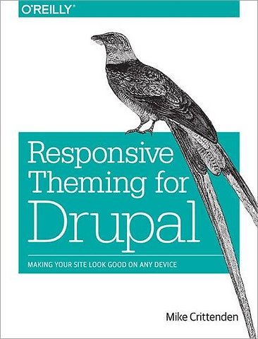
Making Your Site Look Good on Any Device
Samenvatting
If you want your Drupal website to work well on smartphones, tablets, and desktops, this practical guide shows you how to incorporate Responsive Web Design (RWD) with specific Drupal 7 themes. You’ll learn how to create attractive, easy-to-navigate layouts for everything from tiny phone screens to 30-inch desktop monitors—all with the same codebase.
Ideal for experienced Drupal developers, this book takes you through RWD basics and shows you how to build sites based on Aurora, Zen, and Omega—three popular base themes created by Drupal contributors. Whether you’re creating a new site with RWD or adapting an existing one, you’ll learn how to become a better, more efficient Drupal themer.
- Understand how Responsive Web Design and CSS media queries work
- Learn how the Sass stylesheet language and Compass framework support RWD
- Adopt a mobile-first approach to RWD—and learn why it’s important
- Get step-by-step instructions for creating custom subthemes on top of Aurora, Zen, and Omega
- Tackle common problems when building and theming responsive Drupal sites
- Explore alternative options for accommodating smartphone and tablet users
Specificaties
Inhoudsopgave
1. Responsive design: A Quick and Dirty Intro
2. Responsive, Meet Drupal
3. A Short Primer on Sass and Compass
4. Responsive Theming With Aurora
5. Responsive Theming Using Zen
6. Responsive Theming Using Omega
7. Some Common Gotchas and Tips
8. Alternative Options and Next Steps
Anderen die dit boek kochten, kochten ook
Net verschenen
Rubrieken
- aanbestedingsrecht
- aansprakelijkheids- en verzekeringsrecht
- accountancy
- algemeen juridisch
- arbeidsrecht
- bank- en effectenrecht
- bestuursrecht
- bouwrecht
- burgerlijk recht en procesrecht
- europees-internationaal recht
- fiscaal recht
- gezondheidsrecht
- insolventierecht
- intellectuele eigendom en ict-recht
- management
- mens en maatschappij
- milieu- en omgevingsrecht
- notarieel recht
- ondernemingsrecht
- pensioenrecht
- personen- en familierecht
- sociale zekerheidsrecht
- staatsrecht
- strafrecht en criminologie
- vastgoed- en huurrecht
- vreemdelingenrecht


